The first time I heard Donald Miller say, “If you confuse, you lose,” it stopped me. I’ve spent decades working with writers and publishers, and I’ve seen that simple truth play out again and again. Writers often believe cleverness or complexity will sell books. It won’t. What sells is clarity.
 Over the years, I’ve watched the landscape change. Bookstores gave way to Amazon. Flyers and brochures have given way to email lists and social media posts. At one point, every author thought they needed a big, elaborate website. Today, discovery happens elsewhere—on podcasts, in book clubs, through social shares, or directly on Amazon. Does that mean a website doesn’t matter? Not at all. It means its role is different.
Donald Miller’s Building a StoryBrand explains what a site should do, and I’ve seen the same lesson proven in practice. A good website must answer three questions in the first few seconds:
- What do you offer?
- How does it make life better for the reader?
- How do they get it?
That’s it. If those answers aren’t front and center, readers click away.
I’ve seen authors build sprawling sites filled with menus, sidebars, and blog posts that never translated into sales. I’ve also seen simple sites—with a book cover, a line describing the experience it offers, and a bold Buy Now button—outperform expectations. The difference isn’t design; it’s clarity.
Think of it like walking into a room. If the room is cluttered, you don’t know where to sit. If the room has a chair by the fire and someone smiling, you know exactly what to do. A website should be that chair by the fire, waiting for readers to step inside.
Even a well-built website, if left unattended or ignored, quickly becomes dated. What once felt inviting can start to resemble an abandoned house, with spiderwebs in the fireplace and a broken chair in the corner. Instead of drawing readers in, it signals neglect and pushes them away.
For writers, the essentials aren’t complicated:
- Your name and photo.
- Your books, with covers, blurbs, and links to buy.
- A short bio that makes a personal connection.
- An email sign-up for readers who want more.
- Contact and social links.
That’s enough. Anything more risks confusing the very people you’re trying to reach.
I’ve seen projects with polished websites fizzle and books with clear, simple pages find momentum. The difference is clarity. Amazon provides trust and convenience. A publisher’s site can add the personal touch—autographed copies, direct support for the author. A website’s job is not to do everything. Its job is to welcome, point clearly to where books can be bought, and then get out of the way.
The temptation for writers will always be to add more—more words, more features, more cleverness. Resist it. Remember Miller’s phrase: if you confuse, you lose.
So yes, you still need a website. But keep it simple. Use it as a front door, not as a warehouse. Make it a chair by the fire, not a cluttered room. Then put your best energy where it belongs—into writing the next book and connecting with readers who are waiting to hear your voice.
The Power of Authors: A Rallying Cry for Today’s Writers to Recognize Their Power, Rise to Their Calling, and Write with Moral Conviction, written by Evan and Lois Swensen with a foreword by Jane L. Evanson, PhD, Professor Emerita at Alaska Pacific University, launches this September. You’ve been reading its heartbeat in these messages — soon you can hold the book in your hands.


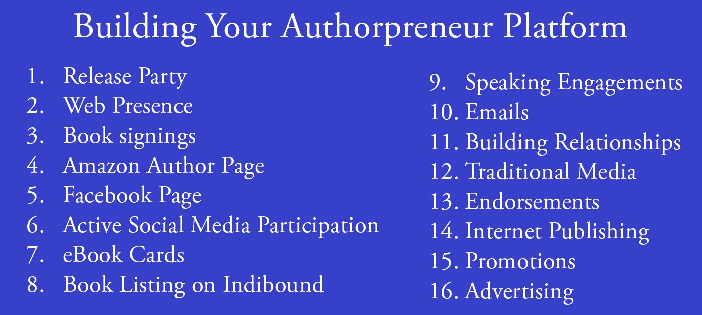
 This is Publication Consultants’ motivation for constantly striving to assist authors sell and market their books. Author Campaign Method (ACM) of sales and marketing is Publication Consultants’ plan to accomplish this so that our authors’ books have a reasonable opportunity for success. We know the difference between motion and direction. ACM is direction! ACM is the process for authorpreneurs who are serious about bringing their books to market. ACM is a boon for them.
 Release Party
 Web Presence
 Book Signings
 Facebook Profile and Facebook Page
 Active Social Media Participation
 Ebook Cards
 The Great Alaska Book Fair: October 8, 2016


 Costco Book Signings
 eBook Cards
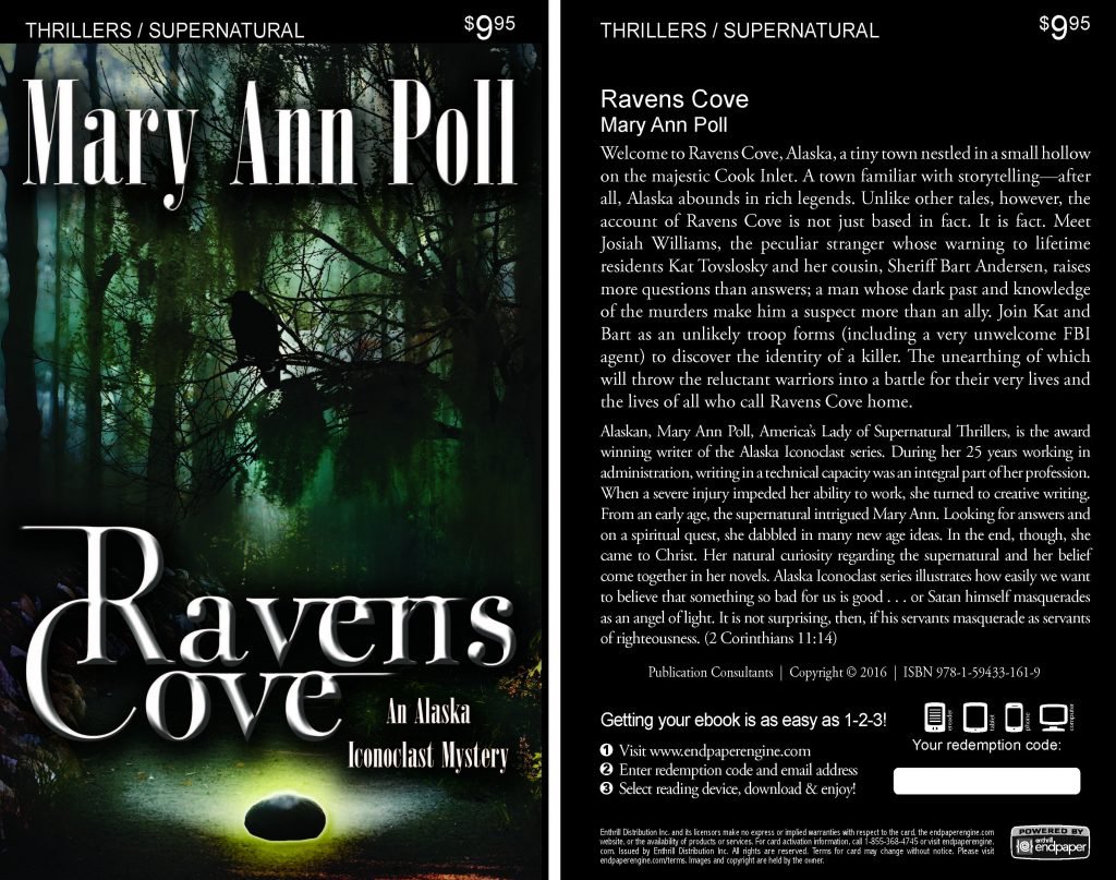

 Benjamin Franklin Award
 Jim Misko Book Signing at Barnes and Noble
 Cortex is for serious authors and will probably not be of interest to hobbyists. We recorded our Cortex training and information meeting. If you’re a serious author, and did not attend the meeting, and would like to review the training information, kindly let us know. Authors are required to have a Facebook author page to use Cortex.
 Correction:
 This is Publication Consultants’ motivation for constantly striving to assist authors sell and market their books. ACM is Publication Consultants’ plan to accomplish this so that our authors’ books have a reasonable opportunity for success. We know the difference between motion and direction. ACM is direction! ACM is the process for authors who are serious about bringing their books to market. ACM is a boon for serious authors, but a burden for hobbyist. We don’t recommend ACM for hobbyists.

 We’re the only publisher we know of that provides authors with book signing opportunities. Book signing are appropriate for hobbyist and essential for serious authors. To schedule a book signing kindly go to our website, <
 We hear authors complain about all the personal stuff on Facebook. Most of these complaints are because the author doesn’t understand the difference difference between a Facebook profile and a Facebook page. Simply put, a profile is for personal things for friends and family; a page is for business. If your book is just a hobby, then it’s fine to have only a Facebook profile and make your posts for friends and family; however, if you’re serious about your writing, and it’s a business with you, or you want it to be business, then you need a Facebook page as an author. It’s simple to tell if it’s a page or a profile. A profile shows how many friends and a page shows how many likes. Here’s a link <> to a straight forward description on how to set up your author Facebook page.


 Mosquito Books has a new location in the Anchorage international airport and is available for signings with 21 days notice. Jim Misko had a signing there yesterday. His signing report included these words, “Had the best day ever at the airport . . ..”


 The Lyin Kings: The Wannabe World Leaders
 Time and Tide


 ReadAlaska 2014
 Readerlink and Book Signings
 2014 Independent Publisher Book Awards Results

 Bonnye Matthews Radio Interview
 Rick Mystrom Radio Interview
 When he published those overseas blogs as the book The Innocents Abroad, it would become a hit. But you couldn’t find it in bookstores.
 More NetGalley
 Mary Ann Poll
 Bumppo
 Computer Spell Checkers
 Seven Things I Learned From a Foreign Email
 2014 Spirit of Youth Awards
 Book Signings


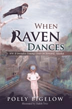 Blog Talk Radio
 Publication Consultants Blog
 Book Signings

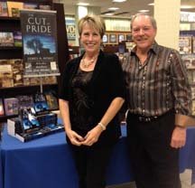

 Don and Lanna Langdok
 Ron Walden
 Book Signings Are Fun
 Release Party Video
 Erin’s book,
  Heather’s book,
  New Books